Today I have uploaded my question 7 to my blog, I have just written out the improvements I think I have made. I also checked everything was on my blog.
Friday, 8 April 2011
Question 7: Looking back at your preliminary task, what do you feel you have learnt in the progression from it to the full product?
Looking back at the preliminary task I think I have improved my music magazine a lot. When we began media it was the first time I had ever used a Mac computer and the software on it, including Photoshop and InDesign.
For the preliminary task we only used Photoshop, when creating my front cover we had to take our own images and I realised I hadn’t had enough time otherwise I could have got a lot better photographs, when taking my photographs for the final product, our music magazine I made sure that I had a lot of time to take photographs and worked out how, where and who I was going to use. I set up a photography plan so I knew everything I was going to do so I could manage my time better. I didn’t really edit my photographs in Photoshop for the preliminary task as I did not have a lot of time, whereas my music magazine photographs I did edit and they looked a lot better.
I think my skills in Photoshop have improved a lot as at the beginning of the course I had never used it, but now I have used it and understand most of the tools included. I also brought the Photoshop programme for my own computer at home so I could carry out things that I didn’t have time to do in class. Also having this programme at home allowed me to have a play with it and understand things more then what I did in my lessons during college.
For our final product we had to use another programme like Photoshop but it is called InDesign. It was also the first time I had used this as we didn’t create a double page spread in the preliminary task. InDesign was quite confusing as I didn’t know what it was like or how it worked but after using it once I got my head around it. Also this came on the same disk as Photoshop as they are similar products so I could also explore with this at home.

 I think by looking at my college magazine- preliminary task and looking at my music magazine – full product that I have improved in using the software, as I edited photographs for my full product unlike the preliminary task. I realised that I had to add more to my front cover and especially my contents page improved as my full product is a lot more busy then my preliminary task, I prefer my music contents page as there is no white on it and carries on with the colour scheme from the front cover.

Creating a double page spread was also a lot different than creating just a front cover and contents page but I think it did pretty well for it being the first time I had used the software and the first time I had created it. For the double page spread you had to think of a story or interview and the artist’s response that you had done on the front cover. This was time consuming so I planned out what I was going to write on it at home so I didn’t waste time on the Macs at college.

Using the college Macs was quite a risk and when creating this music magazine you have to use a Mac as we began creating them on it. When you work on a Mac your documents were only on Mac systems in college and that was difficult as there are only a few around college, but we had them in our lesson so you had to use your time wisely when in our lesson. Also having our things on the college server was a risk as some of the time it crashed, so you had to make sure that you saved everything as you went along. Some of the times the programs mucked up as well so I just had to put up with it but it was a threat to my work as I could not continue with it. One time I also thought I had lost my work and thought I would have had to do my whole double page spread again but luckily it was on my memory stick, so using one of them helped me a lot.
Overall I think I have improved a lot since creating the preliminary task, using different software, creating new things and just using a different computer. My music magazine – full product is definitely a lot better than my college magazine as I have become more familiar with the software and how to use the Macs. I am pleased with my final outcome and definitely think I have learnt a lot from media, as I have done lots of things I have never before. My music magazine is definitely more thought out, making it look a lot better. Editing the photographs on photoshop as well helped me learn how to do that and also made the final result a lot better. I am pleased with my outcome and I have learnt alot.
Thursday, 7 April 2011
What I did today...07/04/2011
Today I answered questions 4, 5 and 6 and uploaded them to my blog. Question 4 I made a portfolio for the people I think that would read my magazine. Question 5 I annotated my front cover, my contents page and my double page spread with the things that I thought would attract and address my audience. Question 6 I just wrote out the answer onto my blog with images of the things I used, so you could see what I used whilst creating my magazine.
Question 6: What have you learnt about technologies from the process of constructing this product?
The technologies now used throughtout the magazine industry are deffinately increasing. The things needed to create a magazine are very technological. For example we need a computer with many programs on it such as photoshop and indesign these are used to create the magazine, you will also need a camera and various other things becoming very technological.
Technology is taking over magazines for example instead of buying the magazine you can now subscribe online or even use the emagazine which is a magazine but online. So it is very economically friendly as they will not print off as many.
During this time of creating a magazine I have used a Mac, I have never used a Mac Computer. I have never used one before so I had to adjust to it, itwas quite difficult at first as the keyboards are different to normal ones, also has many different shortcuts. But once I got used to the Mac I was fine.

I used Photoshop for the first time as well when creating this magazine. I used this for editing my photographs and I also used it to put together my front cover and contents page. I could not get the hang of photoshop to start off with but once I had some help I was also fine with that. I just needed some time exploring it.
I have also used my Computer at home to help me I bought and downloaded Photoshop onto my computer so I could aslo continue with some work at home. This helped because I couldnt get everything done in my lesson and it also gave me free time to explore the programs on it and get used to them a bit more.

I used my Samsung Camera to take my photographs, I study photography so this helped my in the photographic department also the fact that I had my own camera when I needed it.

To make sure I would always have everything depending if I did it at home on in college I would use my memory stick, also to back up my files and make sure I still had them.

Another I used whilst creating this magazine is Indesign, I have also never used this and it came on the same disk as photoshop, it is very different to photoshop and quite hard to adjust to. Once you have had the practice and know what you are doing it is a lot easier. We used this to create our double page spreads as it was better for them then photoshop.

So I have everything together I uploaded all my things I have done to blogger. This is an easy way for anyone else to see all my work. I have never used blogger before either or done a blog or anything like that, so it was a nice experience to use other programs and see other ways or how things can be done.
I have also included power points in my blogger so the only way to upload them to my blog was using slideshare. I have also never used this before and just had fun exploring with it and finding out how to post things to my blog.

The final thing I have used during this is YouTube, I used this for my research to listen to songs that I think were in the genre I did. Once I found a YouTube clip I posted it to my blog, so others can see the videos I have posted too.
These are all the things I learnt how to use whilst creating my magazine. Some for research, some for my blog and others to create my magazine.
Question 5: How did you attract/address your audience?
I attracted my audience by adding various things on my magazine front cover. Below is a picture of the things that i think will address and attract the audience.

This is my contents page, I have annotated things on here that I think will address and attract my audience into my reading my magazine.

Here is my annotation of my double page spread showing the things that I imagine will attract and address my audience.

For Question 5 I annotated my front cover, my contents page and double page spread, outlining the things that I thought attracted and addressed the audience, the things I added to do this job.
Question 4: Who would be the audience for your media product?


Tuesday, 5 April 2011
What I did today...5/04/2011
Today I answered questions 1 and 3 and uploaded 1, 2 and 3 to my blog. For question 1 I did a PowerPoint and uploaded it via slideshare. Question 2 a prezi and uploaded it and Question 3 I did a video on www.xtranormal.com and uploaded it.
Question 3: What kind of media institution might distribute your media product and why?
http://www.xtranormal.com/watch/11671601/distribution-of-my-media-product
This is video that I created on http://www.xtranormal.com/ I chose to answer question 3 by using this product and here is my final result.
This is video that I created on http://www.xtranormal.com/ I chose to answer question 3 by using this product and here is my final result.
Question 2: How does your media product represent particular social groups?
http://prezi.com/1nbbeyhbmkyx/social-groups/
Here is my response to question 2, I created this on http://www.prezi.com/ This is a new program that I used and I enjoyed exploring it and learing how to use it.
Here is my response to question 2, I created this on http://www.prezi.com/ This is a new program that I used and I enjoyed exploring it and learing how to use it.
Question 1: In what way does your product use, develop or challenge forms and conventions of real media products?
For my response to Question 1 I created a Powerpoint. I answered the question within this powerpoint comparing mine and others magazines. Here is my powerpoint on slideshare.

Friday, 1 April 2011
What I did today...1/04/2011
Today I made sure that I was happy with my front cover my contents page and my double page spread. The only thing I didn’t edit was my contents page because I am really happy with that. I also began my evaluation. I started question 2 in class using www.prezi.com this was a site I was new to and enjoyed it.
Friday, 25 March 2011
What I did today...25/03/2011
Today I edited my front cover, I changed some of the fonts I used and moved some things around as I didn’t think it looked as good as it could of. I changed some of the writing on it as well trying to make it look better.
Friday, 18 March 2011
What I did today...18/03/2011
Today I continued playing around with my double page spread making it better as I was unsure on it. I reopened it in Photoshop again and moved things around don the main background.
Monday, 14 March 2011
Flatplan for double Page Spread

Friday, 11 March 2011
What I did today...11/03/2011
Today I continued with my double page spread editing bits that weren’t right, this meant opening the background back up into Photoshop and editing that and placing it back into In Design.
Thursday, 10 March 2011
Final Contents Page

Friday, 4 March 2011
What I did today...04/03/2011
Today I began my double page spread, created my background and everything in Photoshop I then placed it into indesign. I had already written out my questions so I just made sure they were okay and added them in.
Friday, 11 February 2011
What I did today...11/02/2011
Today I changed a few extra things to my contents page I then began editing my photographs for my double page spread and placing them together how I wanted them to be on my double page spread. I have a main layout and I will add various other pictures to it. I will plan out my double page spread and build it off of that.
Thursday, 10 February 2011
What I did today...10/02/2011
Today I finished my contents page, I added pictures and moved and changed a few things to improve it. I am happy with my final contents page and think the changes made it better.
Friday, 4 February 2011
What I did today...04/02/2011
Today I have finished all my information on my contents page and just need to add my photographs to my contents where I have put the squares. I have changed the layout of my contents page from what I created last week and I think it has improved.
Friday, 28 January 2011
What I did today...28/01/2011
Today I made a few touches to my front cover and began my contents page, I do not yet have an image for my front cover but I will add that in once I have it. So as I didn't have these images I decided to have a play around on Photoshop to see how I wanted my contents page and started constructing it.
Construction of Contents


This is my first screen grab of my contents page I have created it on photo shop using different tools. I then created this boxes to add my pages and my pictures.
This is my second screen grab of my construction, I have added more pages and original artist's name onto the contents using different tools. I also changed my construction of adding sub headings making different sections.

This is my third screen grab I have finished adding my information and page numbers, next time I will just need to add my pictures onto it. This is my fourth screen grab. I like how I have arranged the pictures on the contents page and some link to the things I have included on the contents page.

Tuesday, 25 January 2011
What I did today...25/01/2011
Today I have uploaded my construction of my magazine front cover using screen grabs whilst I have been constructing these. They show the tools I have used and also the progress I have made. I have now finished my front cover and have uploaded this onto my blog so I can see my final front cover.
Final Front Cover
This is my final music magazine front cover, for the music genre: indie. I have uploaded all the stages of constructing this and all my research involved with the music genre indie.
 I think this magazine is a better than my student magazine as I have been able to have the experience of creating it before. I thought it would be okay without the banner at the top including the puff but it looked really bare in the corner so I added this to fill the space and advertise something else that would help sell my magazine to the audience.

Construction of my Front cover

This is my front cover when I first began creating it. I was constructing this in photo shop, Firstly I added the masthead in . font. I then added my tag line just underneath my masthead, explaining about the magazine and what is in it. this is a screen grab of when i was constructing my front cover showing the tools I am using.


Here is my forth screen grab of my front cover. I have now added a puff some more cover lines and banner advertising indie festivals.

Here is my final screen grab, this is my finished front cover and I am pleased with my outcome. I have added a few final things and edited some.
Friday, 21 January 2011
What I did today...21/01/2011
Today I have edited my pictures a bit more on photo shop, my final image for my front cover magazine. I also started putting together my magazine front cover in photo shop. I have done quite a bit to it and need to update the screen grabs of my stages to illustrate what I have done.
Tuesday, 18 January 2011
What I did today...18/01/2011
Today I have uploaded my images onto my blog to show what they are all like and what one I have chosen. I also added my poll of music genre votes to my blog to show what the most popular is.
My Photos


On the left is the original image, and on the right is it after being edited, I like this photograph and think I will use it for my magazine front cover.


 I really like this image on the left above but it has too much detail int he background so I don't think it is right for a magazine front cover, so I chose the top one.

Sunday, 16 January 2011
What I did today...16/01/2011
Today I have looked on Google for some images of indie and looked at some magazine covers, to try and get a better image in my head of what I want to create. I have printed some pictures and I'm going to put together a collage/montage type thing to put together my ideas and figure out how I want my model to pose. I took my photographs later today as well for my front cover and double page spread I am happy with these and will begin my front cover.
Photoshoot Plan
Before shooting my images, I made this plan, got the images off google for more of an idea of what poses and styles I was going to use. I'm not going to copy the photos I'm going to add my own twist to them. Here is the plan and what I am thinking of doing.

I'm choosing to take a photograph in a studio type setting for my front cover and then for my location shots that are going to go on my double page spread I'm going to take them in a natural environment for example outside.
Friday, 14 January 2011
What I did today...14/01/2011
Today I have written my proposal and planned out how I am going to create my music magazine. I have written it in my blog and posted it, including fonts, colours, images and other. I also thought about my photos and how I was going to take them I just need to write my ideas down and plan my photo shoot.
Thursday, 13 January 2011
What I did today...13/01/2011
Today I have written about my genre I have chosen which is indie, and I have found music magazines that are based on indie. I have then found examples of bands and singers and posted them onto my blog. I have also researched into 'indie' as it is the genre I chose, I have uploaded what I have done onto my blog and will need to add a bit more to it as I have only explained the music and stereotypes.
Research into Indie
Indie Music
Indie stands for independent, it describes independence. Today we stereotype people a lot for example the way someone dresses, we automatically categorise them. Here are some examples of what we think ‘indie’ people wear, there are four different outfits that I have constructed on a website, which is www.polyvore.com
Indie Outfit 1 – This is an outfit that I would say is an everyday outfit. They wear different things to what has been around for a while; it seems to have come back into fashion lately people may dress like this because they like it or because they are following a group. Most ‘indie’ people dress the way they do to be different from others and set their own trends of what they like suggesting independence.
· A baggy jumper.
· Leggings
· Boots
· Fluffy/Big socks above the boots
· Bracelets
· Big earrings.

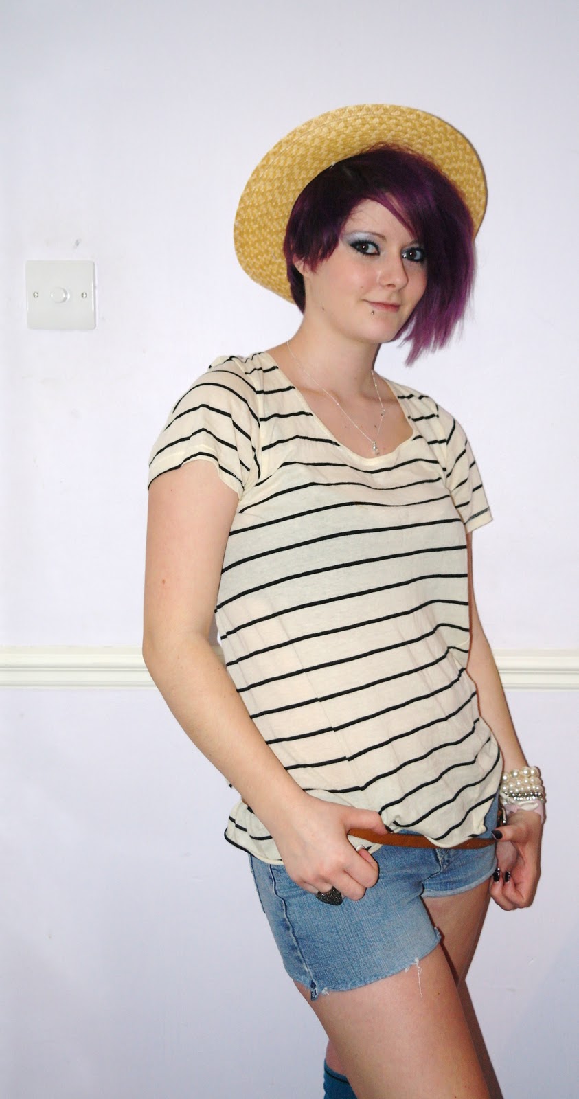
Indie Outfit 2 – This is an outfit that I would say is a festival outfit. This is the type of outfit that you would see someone wearing to a festival like Reading or Glastonbury as they like their music and go to festivals to see their favourite bands. I class this as indie as well as they mix and match random things but put it together well. Stereotypically ‘indie’ people look after themselves; the way the look and they are fairly skinny with curves, as they can wear things like this:
· Short Shorts
· Long Socks
· Printed Wellies
· Flowery/Feminine top
· Straw summer hat

Indie Outfit 3 – This is also an everyday outfit. These are the type of clothes we also stereotype as an ‘indie’ outfit. The tight jeans and baggy checked shirt. ‘Indie’ have their way of dressing which is how they like to look. The fashion of old clothes coming back in to fashion like baggy and tight.
· Tight ripped jeans
· Baggy checked shirt
· Leatherette Zigzagging Oxford flat shoes

Indie Outfit 4 – This outfit is a going out outfit. Something that people with their independent fashion for going out to a nice/posh place, or if they want to look nice/posh. This is what I see as an indie outfit as they were big accessories girly clothes – floral and heels.
- Floral Dress
- Baggy Cardie
- Cream Bag with elegant accessories
- Cream Heels with Statement Bow

·
This is the clothing I associate with indie, the stereotype I see. Also the poses in this photograph suggest independence and their own style, not afraid of what others think. I like this style of images as they look good and advertise different types of clothing. I like the way this picture is put into a rectangle with for images I think it looks really good, and would like to create something like this for my double page spread.

Research into Music Genres

Research into Music Magazines
Current Music Magazines
NME – This magazine company have had 58 years experience of being part of the music industry. The company was launched in 1952; the New Musical Express is the world’s greatest and most influential weekly music magazine known as NME.
Since starting this magazine they have been responsible for:
· Creating the first UK singles chart
· Hosting The Beatles, The Rolling Stones & The Kinks at our live shows
· Bringing punk to the wider world
· Breaking acts such as Jimi Hendrix, Sex Pistols, The Cure, The Stone Roses, Nirvana, Blur, Oasis and the Arctic Monkeys
· Pioneering funny, critical and truth-telling music journalism
They remain the world’s most recognized and iconic music magazine. They have been there from stunning features to their unique inside information; NME has a proud and colourful history. They were there when The Beatles broke up, also the death of Elvis and many other things.
This is NME music magazine's logo/masthead:

‘We're the magazine that bands read. There isn't one magazine guaranteed to give an as truthful, honest, informed account of what's going down in music as NME. And we do it because we don't want to be lied to either – after all, this is rock'n'roll we're talking about, it's too important for that’ – quote from NME’s website.
‘NME's circulation increased by 9.7% year on year to 76,792 copies, just 627 ahead of Kerrang!’ – quote from the guardian.
NME also have a trial offer going at the moment, which is 4 issues for £1, which is good and makes more people buy the magazine as it attracts the readers more. Which means NME’s sales will be higher than before as more people will buy it when there is a deal involved.
The reason for NME’s success I think is that it is a well created magazine including lots of information that appeals to people that enjoy music. The magazines are filled with lots of good information and many things that inform people about new bands, old bands and other things like I mentioned above. The only thing that I think that isn’t very good about NME and is why I wouldn’t buy it is because of the price it is fairly expensive and I wouldn’t think it was worth it as I don’t enjoy reading music magazines, whereas others might enjoy them and think it’s a reasonable price for the size of the magazine. But when it’s on the special offer of 4 issues for £1 I may think differently about it.
Kerrang! - Kerrang! is a rock magazine published in the United Kingdom. The magazine name is onomatopoeic and refers to the sound made when playing power chord on an electric guitar. It began publication in 1981 and is still being published today. Kerrang! is a popular music magazine and includes a lot of different rock bands new and old. Kerrang!’s first successful period came in 2000, it featured bands on the cover like Papa Roach, Slipknot and Linkin Park – all well known bands today. Emap launched Kerrang! Australia in the late 1990s. Unlike Kerrang in the United Kingdom which is published weekly, the Australian version is published monthly due to competition from free local music publications. Kerrang! is also published in Spanish.
This is Kerrang!'s logo/masthead:

‘ Emap's weekly title recorded the biggest increase in circulation in the rock music sector, up 23.2% year on year and 18% on the period to 76,165 copies.’ – quote from the guardian.
I think the success of Kerrang! is due to the information included in the magazine. For example, well known bands, interviews with some band members, posters and also information on gigs. These are all the things that someone that wants to buy a music magazine will look for. The price of Kerrang! isn’t as expensive as some magazines as it’s not as thick, but it still manages to hold a lot of information. I also thing the front covers are also eye catching, the big bold masthead, the colours and also the pictures it always seems to stand out.
Subscribe to:
Comments (Atom)